This data was compiled by and shared with Week Without Driving courtesy of the Climate and Community Institute (CCI). The maps were created by CCI fellow Kira McDonald, as part of research efforts for the CCI brief “Cheated by Car Dependence.”
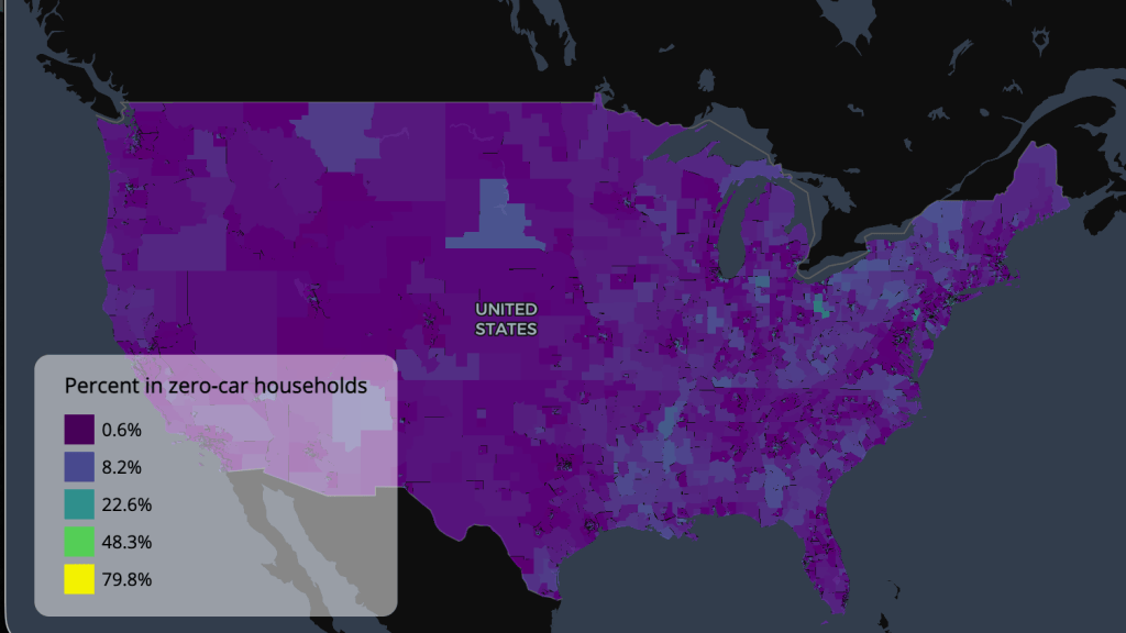


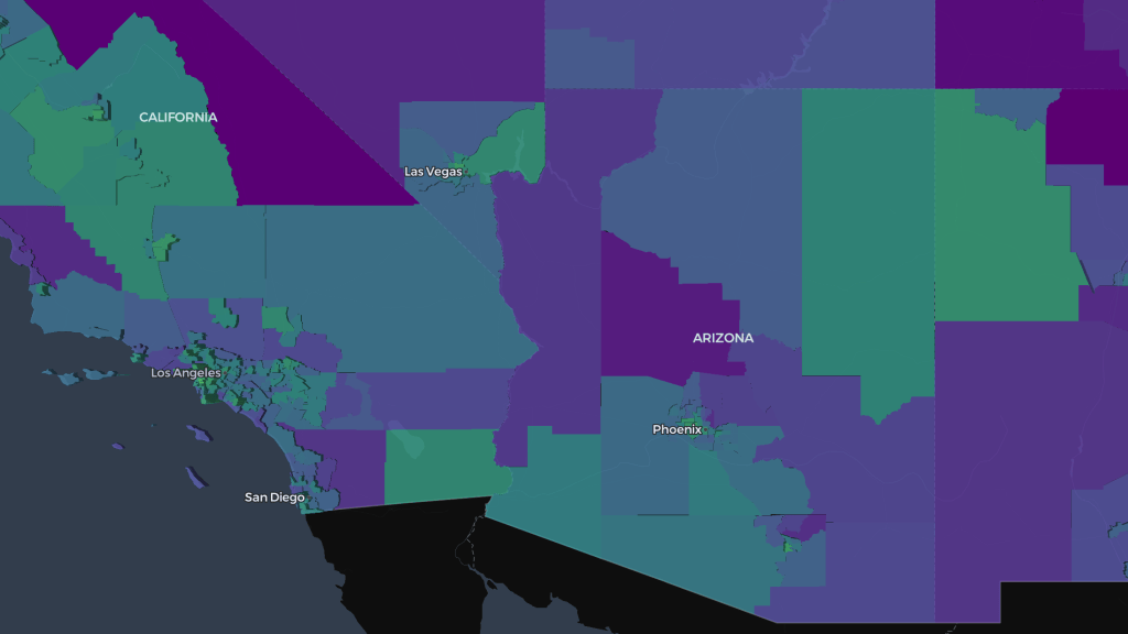
How to interpret the maps
- The geographic units that divide the map are large-scale communities, typically comprised of towns, counties, groups of counties, or neighborhoods within larger cities. Technically, they are defined as Public Use Microdata Areas (PUMAs), defined by the US Census as “non-overlapping, statistical geographic areas that partition each state or equivalent entity into geographic areas containing no fewer than 100,000 people each.
- Hover the cursor over a PUMA to see the value.
- Click on a PUMA to see more information, including the name of the PUMA, the population density (people per square mile), population, etc.
- Use the search window to look up a specific PUMA or geographical keyword.